My Favorite Shades of Gray

Right about the time I stopped writing was when the "Gray train" hit and gray became the new beige. Pretty much every house I have done has been Fifty Shades of Gray. I have a love/hate relationship with it. I love how it looks, and I especially love that it hides dirt and scuff marks, but it's so unpredictable. I know I'm late in the game posting about gray, but I see a lot of misinformation out there on the internet so I thought I'd set the record straight on a few colors.

I am not an Interior Designer, I am a color consultant and worked in a Benjamin Moore store for 11 years. I have chosen literally thousands of colors for customers and clients. I know Benjamin Moore colors inside and out, and was featured on their website as one of their paint color experts. Interior Designers actually come to me to ask which colors to use because I have so much experience with them and have seen certain paint colors over and over and over again. I know which colors work, and which ones don't. So, I thought I'd share my thoughts on grays.
First let's look at a video I did in 2013. First of all, I'll warn you this is not a professional video, not even close! It was shot with my iPhone spontaneously one day when I was working in the store. Then I went to my clients' house and she held my phone while I recorded. The sound is not great so turn your sound all the way up before you watch it. It's lousy quality, but good information and it did get over !40,000 views! I tried to make it as simple as possible and stuck to just two colors to talk about. Stonington Gray and Revere Pewter.

The basics of choosing gray colors is this. There are either WARM grays or COOL grays.
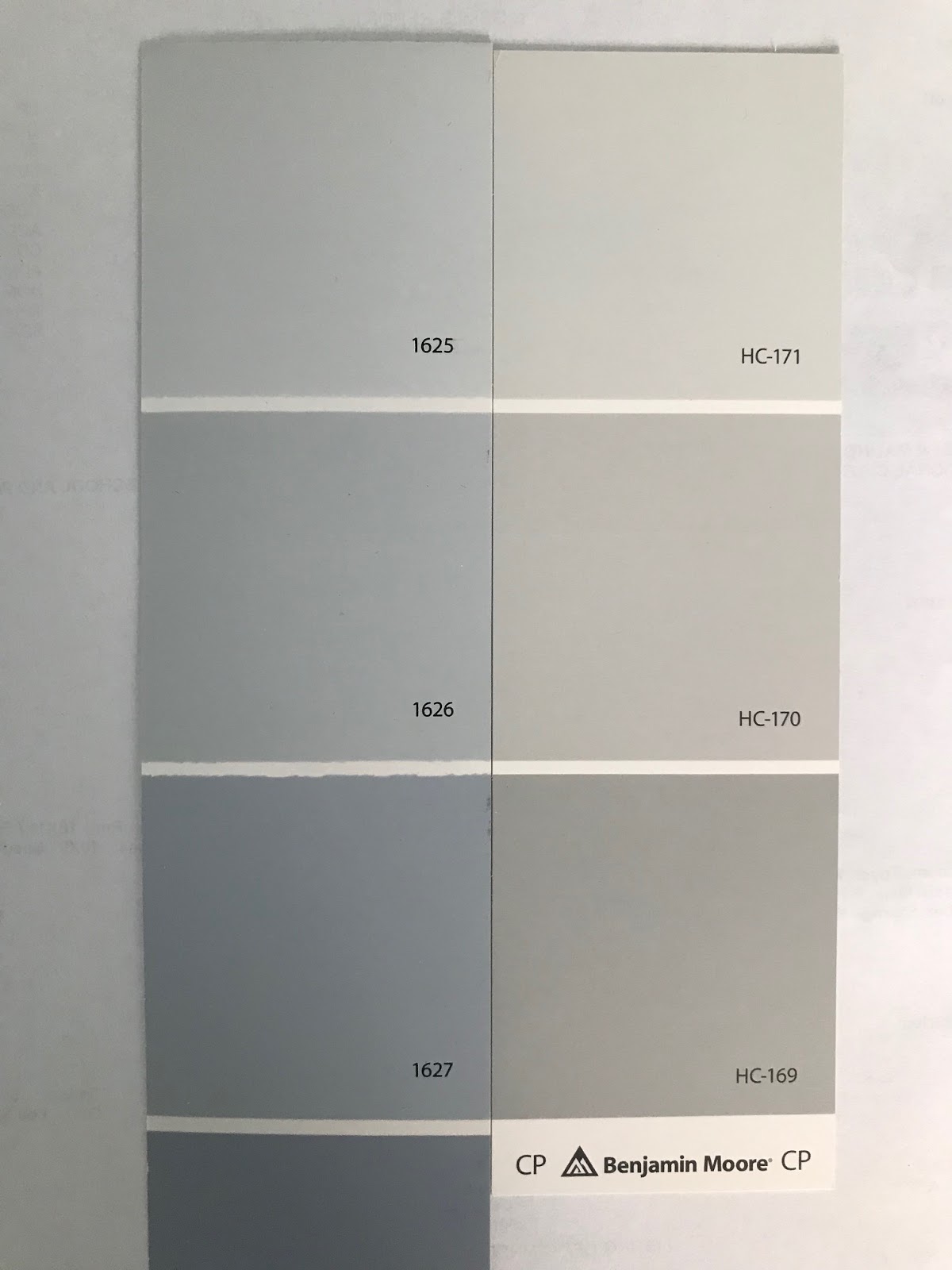
Warm Grays have beige in them, and Cool Grays look more like a silver gray. This is demonstrated clearly when you look at Stonington Gray HC-170 which is cool and Revere Pewter HC-172 which is warm.

Revere Pewter and Edgecomb Gray (which is lighter) are what I call the perfect "Transition Colors". If you have beige era furniture and just want to give the room an update, these colors will work with all of your beige stuff. Whenever I'm called in to choose a color for what I like to call a "Tuscan Kitchen" (Cherry cabinets and beige tumbled marble backsplash) the first colors I pull out are Revere Pewter and Edgecomb Gray. There is enough beige in them to look really good next to the tumbled marble, and yet they are gray enough to make the room look more updated.


If you look closely you'll almost see a drop of yellow in these colors too, so they go really well with rooms that have yellow in them. I have found that Revere Pewter tends to look too dark in most smaller spaces so I tend to use Edgecomb Gray 80% of the time. The down side to Revere is it has a tendency to look green next to anything that has a slightly pink undertone.

Stonington Gray is a great cool gray. It's a great gray however I have seen it turn blue, green and blue-green. It's my favorite color for boys' bedrooms and works really well with Navy Blue and Red. I like to use it with a navy blue accent wall.


Now, let's move on to other grays. As everyone has jumped on the gray train and the years have gone by I have done more and more homes that have been remodeled and have new furniture. So I find myself using Revere Pewter less and less. It's just too beige with most new stuff. Let's talk about the colors I use much more often now.


In the Benjamin Moore Classics fan deck I have it narrowed down to 5 strips of grays.
All the way to the right you'll see the strip with Silver Bells 1458 looks a little purple. I rarely use it unless it matches something in the room (I have seen a lot of bathroom tile that matches this) or if it's a bedroom where I actually want a hint of lavender undertone.99% of the time I will eliminate this Silver Bells strip out of the mix.

The second strip from the left you'll see the strip with Horizon 1478 and Alaskan Husky 1479. This is a silvery gray strip that works well with Carrara Marble. If Stonington Gray looks too dark or heavy, then I will pull out this strip. But as with Stonington, these colors may turn blue. (Horizon also reappears in the OC colors.) When I'm looking for a true gray that won't turn blue, I eliminate this strip from the mix.

The last three strips are the strips that I use the most often.
All the way to the left you'll see Classic Gray 1548, Balboa Mist 1549, Cumulus Cloud 1550, Paloma Gray 1551.
All the way to the left you'll see Classic Gray 1548, Balboa Mist 1549, Cumulus Cloud 1550, Paloma Gray 1551.
The center strip has Shoreline 1471, Silver Chain 1472, Gray Huskie 1473, Cape May Cobblestone 1474.
The fourth strip has Light Pewter 1464 (it's a hint more beigey than the others) Nimbus 1465, Smoke Embers 1466, Baltic Gray 1467.
Out of all of these I would say I probably use Nimbus the most.

For lighter grays, go the the Off White OC Colors. Here you'll see that Classic Gray and Balboa Mist make a reappearance as OC-23 and OC-27. I also like Silver Satin OC-26 and Collingwood OC-28.

Silver Satin

Balboa Mist and LaPaloma Gray


Smoke Embers

Nimbus

More COOL Grays.
Other cool grays like Sterling 1591 and Graytint 1611 can be really pretty, but may look like light blue in most rooms. If you like blue, and you're ok with it looking a little blue, then that's not a bad thing.


Here are strips of cool grays. I put Nimbus next to them so that you can see how cool they are in comparison. Most of these look good with gray marble, but could turn blueish.
To see how blue a color may look, put it next to Stonington Gray.
One color that seems to be recommended a lot on the internet (although I have NO idea why!) is Gray Owl OC-52. The color is GREEN. It comes from the gray/green section of the Color Preview section and is also known as 2137-60. I only use it when I want a really gray green (which is almost never). If your lighting is pink and turns gray colors too pink, then you may want to try Gray Owl because it may actually look gray in your lighting.


Gray Owl
When I want a dark, charcoal gray, my "go to" is Cinder AF-705 from the Affinity Collection. It's a good neutral gray that does NOT have beige or blue undertones. I like it in bathrooms and laundry/mud rooms that have all white cabinets. It adds a nice dramatic edge. If I'm using warmer grays like Revere and I want a darker gray, I'll use Chelsea Gray HC-168 or Kendall Charcoal HC-166.

Chelsea Gray

Cinder
So, how do you know which one of these colors to use? Well, I always match whatever is in the room. If it's a bathroom I lay the chips on top of the tile and see which gray matches the best.

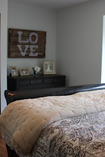
If it's a bedroom I'll look at it next to the headboard or the bedding. If it's the living room I look at it next to the couch.

I recently went to a newly constructed home that was painted the same color gray throughout the entire house. But it looked green everywhere because the color didn't go with any of the tile. The bathroom had a slightly purplish undertone making the walls look green. I fixed it by using Metro Gray in the bathrooms. The kitchen cabinets were more of a taupe color so we had to use taupe in the kitchen and family room to fix it. My point is, you can't force a color to work if it doesn't go with your stuff.

There is nothing about this wall color that works with this kitchen!

You can't tell from the photo because the filters bleached the photo. But in person the walls have a green undertone next to the tile which has a purplish undertone. They just don't go together. By laying the paint chips on top of the tile it was easy to choose the correct shade of gray. Metro Gray.
Lighting.
Lighting is a big factor that will affect how the color looks. I learned from a photographer that daylight is BLUE. So if you have a lot of daylight coming in it will make your paint colors look cooler and bluer.

Lamp light can be pink or yellow and newer LED lights are cool blue. This will affect the color. So make sure you sample your colors in your lighting. The way it looks in the store is not how the color will look in your house. While we're on that subject, a color that looks great in your friends' house will probably not look the same in your house. Their furniture is different as well as their lighting.
Sampling.
When sampling, do NOT put the samples directly on the old color. You won't be able to tell how the new color will look. The old color will visually get in your way.


Also, do NOT line the colors up next to each other. The undertones will be drawn out and you won't like any of them.

The best way to see colors is on a clean, white slate. Either paint primer on the wall and sample colors on separate sections of the room, or paint on poster board leaving white edges around the sample.See how the colors look in daytime and nighttime.

So to recap, the most important thing to do when choosing gray is to match your existing stuff in the room. Then sample it on a clean white slate. Then check it out in your lighting. Hopefully one of the colors I mentioned above with be a winner!
I have to say I am in the middle of a total color block nightmare right now and its giving me a migraine. I wish I found this article 4 years ago. When we moved to our home I was certain that any color that I had seen in any house would look great on any wall. All the walls when we moved in our home were a yellowish cream color (in hindsight now I know why), so after doing a little research, I decided to trust people on the internet and proceeded to spend a fortune on paint to paint my 2600 sqft house. After scouring images and deciding I wanted to see true light to medium grey tones with aqua accents in the décor, thinking coastal, (hoping it would brighten my space), I used what was trending at the time and being recommended online! Big mistake! So I proceeded to paint: Grey Owl in all my stair wells (no windows/no natural light), Grey Owl in my second living room which gets a ton of light all day, Stonington grey in my formal living room and sons bedroom (living room is North facing and my sons room although gets full sun but the Stonington never looked right, it looked dirty), revere pewter in my dining room, etc. Long story short nothing ever looked right! As I did a bunch of research, as I am getting ready to finally repaint many areas of the home (I definitely do not want to make the same mistake) I never understood why my entire house looked horrible but then realized my house is Northeast facing, and I'm sure as you read this that you guessed it, the grey owl is a horrific dirty greyish green which the color changes from one corner to another making me insane, the Stonington looks greenish and dirty, the revere pewter pulled odd hues of color falling flat and never really pulled the warmth and it has just been an enormous struggle. As I sit here now mulling over endless paint chips (talking like literally 150 paint cards from different vendors) I am lost. Every chip I put to the walls looks wrong, If the undertone is too warm or violet it looks purple, if its too cool it looks dirty green. I'm stumped. With all that said thank you for this article, I am going to go and get some of the color strips you have recommended above in the warmer family and hopefully I will find a winner. At this point if I can just find one color, just ONE color that looks right I will go with that right through the house. Thanks again and I am hoping this will point me in the right direction!
ReplyDeleteThis post is extremely helpful. I have done tons of paining over the years and know just how hard it is choosing paint color and getting it just right. Now with all the choices we have today in paint colors, seeking help on the Internet has you going in all kinds of different directions leading to extreme confusion and indecision. The representation of color on computer monitors and from one image to another on the Internet is very inaccurate. Then you have people posting pictures of rooms they painted on their blogs in all kinds of lighting and that is no help either or can be misleading. The Paint Diva addresses all the gray chaos out there and presents her take on the most popular gray colors concisely with explanations on narrowing them down, her method of choosing and why it works. Her candid thoughts and insight from direct experience regarding some over rated colors such as Gray Owl are also appreciated.
ReplyDelete