The Right Soft Blue Hue

The other day I went to a client's house to help her choose a soft blue color for her daughter's bedroom who was home from college for winter break. The mother had already been to the paint store and had returned with about thirty swatches of blue colors, all of which were way too bright. When they walk into the paint store looking for blue, they head straight for all of the blue colors. Sounds like the right thing to do, right? Wrong!
 |
| WRONG! |

The mistake my client made by choosing bright blue instead of soft, gray blue is one that most people make. I had to give her a color lesson which I have given countless times over my 15 years of working as a color consultant.
The color she was actually looking for was a GRAY that reads blue, not an actual blue.
She was so confused. "Are you sure it's not going to look gray on the walls?". I assured her it would not. "But how do you know?" she asked.

I explained to her that years ago while I was working in a paint store (I worked for a Benjamin Moore Retailer for 11 years) and when the gray trend began, people were choosing cool gray colors for their walls. But then they returned to the store complaining that the color turned blue. It was then that I learned that when I want a nice, soft, soothing blue, I should actually be using these cool gray colors. I learned a lot working with thousands of customers over those years, and most of what I have learned about color has all been through mistakes made by customers or myself! Now I teach others how to not make the same mistakes.

Here is the color lesson I shared with my clients.The first problem they were having was that they were looking at the colors they had originally chosen against the old wall color. I chose the color "Gentle Gray" for the daughter's room because it went really well with the new comforter they had just bought for the room. I showed her my Gentle Gray against the purple walls. Compared to the bright purple, Gentle Gray looks gray.

Next I put an actual gray (I like to use Stonington Gray as my "measuring stick") next to the Gentle Gray, and voila! Suddenly Gentle Gray looks bluer in comparison!

Then the final step was to show them the colors against a white background. I usually just hold the chips up against the white door or window trim. But it they're not white then I'll grab a piece of white paper and hold it up behind the chips. Now you can really see the difference! Finally I was able to convince her that the color I chose would in fact look blue on the walls, not gray.

The mom just couldn't understand how a color called "Gray" could not be gray! It wasn't until I showed her the chips above that she was finally convinced. She was shocked to see how blue the Gentle Gray actually looked! She is not alone. Very often people make the mistake of judging a color by it's name. Just because it's called "gray" doesn't mean it is.
 Here's a really confusing one! You'd think "Nimbus Gray" would be gray, and "Nimbus" would be, well, something else. It took me a while to catch on to this one. When people asked me for "Nimbus Gray" I reached for the gray one, not the blue one. It was a mistake I made repeatedly.
Restful Bedrooms.
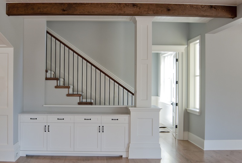
I consider stronger blues to be "little boy blues" and look like they belong in a young boys' room. But when you add gray it looks more sophisticated. I call these soft, tranquil gray/blues "grown up blues" and they look good pretty much anywhere. They are my favorite look for bedrooms because the colors are "calming, restful and, spa-like". Some favorite Benjamin Moore blue/grays are Quiet Moments, Iced Cube Silver, Pale Smoke, Beacon Gray, Feather Gray, Silver Cloud and Gray Cloud.


Where to look for Gray Blues.
If you're in the Benjamin Moore store, there are two places to look.
First look in the Color Preview section of colors.
This is the Color Preview Fandeck. Most people don't realize there are more than one. |

 |
Some stores have this OLD Benjamin Moore display. |
| Find the Color Preview section and look at the blue grays in the right, middle section. Look at color with numbers running from 2119-2136. They all turn blue. |


Some stores have the NEW displays.
If your store has the new display then look over to the right for the blue/grays.

This is the Classic Color Fandeck.
The second place to look is in the Classic Color Collection. Look on the bottom at the gray colors.

In the OLD display you'll find grays on the bottom right, and some gray blues on the second row from the bottom all the way to the left. (The color numbers are scattered all over the place so I won't give you numbers, it will just be more confusing.)

In the NEW display they finally lined everything up numerically like they are in the fandecks. Gray blues run from around 1562-1635.

If you're in the Sherwin Williams store, then look in their section of neutrals. Use Lattice SW 7654 as your measuring stick.


Lighting will affect how the colors look in your home. I learned from a photographer that natural daylight is BLUE. Light bulbs can give off light that is blue, yellow, pink or peach.

Keep in mind that how the color looks in the store is NOT how it will look in your house. So grab a bunch of chips and take them home and look at them in your room and your light. If you don't have great lighting in your room the gray blues may actually look too gray, so you may need to move over to bluer blues. So grab sample chips of brighter blues as well as grayer blues.

As I showed in the example above with the chip against the purple color, when you look at the chip in the room, don't hold it up against the wall because the old wall color will affect how your new chip looks. Hold the chip up against something white. I always look at a chip against white window trim or against a white door. If there's nothing white in the room then hold a piece of white paper up on the wall and then look at the chip on top of the paper.

When you find the color you think you like then try a paint sample. Again, look at it against white, not against the old color. Either paint the sample on a white piece of poster board and leave the surrounding edges white, or prime over the old color first. I like to paint samples against a door or window so you can see the color against the white trim.
Speaking of trim, if you're going to use a really soft, light blue, you'll want truly white trim. Anything else will look yellowy or dingy. My favorite Benjamin Moore trim color is Super White, or you could use Decorators White because it's a blueish white. If you're using Sherwin Williams, try High Reflective White or a blueish white is Extra White.
That's all for today. I hope I helped you to find the right color and not get the blues from trying to find the right blue hue!

Comments
Post a Comment