It's easy to be green!
As a Decorating and Color Consultant who helps choose paint colors for people for a living, the word "Green" has two meanings to me. The first being"organic" or "good for the environment", and then the more obvious definition, the color green.
 (Bunker Hill green 566)
Since this is my first blog, allow me to introduce myself. I'm a decorating, staging and color consultant, working independently, and working in-house for a Benjamin Moore retailer, helping thousands of people choose paint colors for their homes. I have been dubbed everything from "The Paint Doctor", "The Paint Guru", "The Paint Goddess" and "The Paint Whisperer" to my personal favorite, which is "The Paint Diva".

I have come to learn that I am not the original "Paint Lady" for Benjamin Moore. Originally there was a fictional "Betty Moore" that was the "Betty Crocker" for the company, that you could consult with about paint colors. She is my muse, I suppose. I wonder what her favorite greens were in the 1940's.

So, let's talk about my first definition of "Going Green". Throughout the '90's and beyond I was a mural artist, and faux finisher. I always knew Benny Moore had the best beiges, and certainly had good quality paint. But I had allergies and chemical sensitivity, and if I had to paint in a small, enclosed space, like a bathroom, sometimes the smell of the paint nauseated me. It seemed also that it depended on the colors I chose, clueing me into the fact that the smells may lie in different tints.

I retired from painting and went to work in a paint store as their in-store designer in November of 2006, and about a year later Benjamin Moore came out with their "Aura" line. They said it was self-priming, had nearly one coat coverage, and virtually no odor. Of course I had to test it out!

I painted a ceiling (yes a ceiling) in a deep purple color, and yes, it just about covered, and just needed a second touch up coat. Pretty good. But the real test was when I converted my son's room into an office.

I painted over a beach scene mural with a soft blue/gray. (Gossamer Blue) It didn't seem to totally cover with the first coat, but almost... and then I walked away and had lunch. When I returned, the paint had floated out and practically the entire mural was covered! On top of this, it had no odor! Hallelujah, I had seen the light, and became a believer!

The Aura has 50% less VOC's (Volatile Organic Compounds: basically the stuff that smells and is bad for the environment) and is self priming. Another option is Natura. I always say, think of the word "Nature". It's 0 (zero) VOC's. No chemicals, no odor. But it's not self-priming so it doesn't cover as well. Usually pregnant moms are the only ones who ask for it in the store, but from my perspective, Aura is the way to go. It's more expensive of course, but I always compare it to shopping at Whole Foods. ;-)

Now, for the color green. Woo hoo! The fun part! I tend to use green in kitchens and bedrooms the most. I prefer "earthy" greens. I don't want them too lime, or too much of a... shall I say, a "Grandma Green", where you feel like there should be an infusion of flowered wallpaper in the room. They may have worked for Betty Moore, but they don't work for the Paint Diva! The ones I use the most are:
Dried Parsley 522 and the Affinity color for Aura paint that looks practically the same, Grasshopper AF-415. If you truly want the low VOC's and no odor, choose one of the Affinity colors. It's a whole different tinting system that interlocks with the paint. This also makes it more durable.

Nantucket Breeze 521 is a little lighter than Dried Parsley,

and Lewiville green 494 and Harbor Town 493 are great choices as well.

For sage greens, Pottery Barn was on a big kick with these colors for a while, and I still like them because they work well with the grays that are so hot right now. Their favorites are Silver Sage 506,

Grecian Green 507,
.jpg)
and Saybrook Sage HC-114.


A while ago I was in the mall and snapped a picture of Restoration Hardware when they had painted the walls a dark, gray-green.

I became obsessed with that color because I loved how it made the trim pop. (Since then they've switched over to the distressed, washed out look, which I am so over ;-)
To achieve this look, I love Gloucester Sage HC-100.

Again, for that "earthy" green look, I like Providence Olive HC-98,

and Rosemary Sprig 2144-30 .

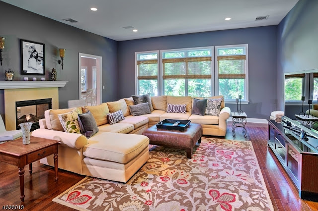
Now, for my absolute favorites. It seems I have a "signature look", which is very soft, calming and restful. I've been invited back to a lot of homes after they've been painted and I now laugh at myself because I can now tell the rooms that I've chosen the colors for! I prefer for you to NOT walk into a room and say "Wow, that's a green room". I like just a hint of barely-there green, just a whisper of color. I achieve that by using gray with just a hint of color. (Horizon gray 2141-50)

In my area of Northern New Jersey, there are a lot of kitchen and bath remodels going on. A lot of people do white cabinets, with white subway tile and dark, hardwood floors. My favorite look! I like to do my soft, whisper of color. If I go green, I will use colors like Gray Cashmere 2138-60,

and Green Tint 2139-60.

When it comes to kids rooms though, all bets are off! Kids love color! Especially girls from 9-14. They rebel against all pink! They want an infusion of color. Usually, thanks to Pottery Barn's PB Teen, they like tropical color!

Aqua blue, lime green, sky blue and if they still like pink and purple, they want hot pink, and deep purple. Two of my top sellers are Potpourri Green 2029-50 and Stem Green 2029-40,

Pear Green 2028-50, and variations thereof.

If I'm doing colors for a shore house, I love to have fun and use softer lime greens mixed with turquoise blues, but we'll save that topic for another day. Until then, I'll leave you with the song that's been stuck in my head all day, Kermit the frog's "It's not easy being green"...well Kermie, now it is my friend, now it is.


Since this is my first blog, allow me to introduce myself. I'm a decorating, staging and color consultant, working independently, and working in-house for a Benjamin Moore retailer, helping thousands of people choose paint colors for their homes. I have been dubbed everything from "The Paint Doctor", "The Paint Guru", "The Paint Goddess" and "The Paint Whisperer" to my personal favorite, which is "The Paint Diva".
I have come to learn that I am not the original "Paint Lady" for Benjamin Moore. Originally there was a fictional "Betty Moore" that was the "Betty Crocker" for the company, that you could consult with about paint colors. She is my muse, I suppose. I wonder what her favorite greens were in the 1940's.

So, let's talk about my first definition of "Going Green". Throughout the '90's and beyond I was a mural artist, and faux finisher. I always knew Benny Moore had the best beiges, and certainly had good quality paint. But I had allergies and chemical sensitivity, and if I had to paint in a small, enclosed space, like a bathroom, sometimes the smell of the paint nauseated me. It seemed also that it depended on the colors I chose, clueing me into the fact that the smells may lie in different tints.
I retired from painting and went to work in a paint store as their in-store designer in November of 2006, and about a year later Benjamin Moore came out with their "Aura" line. They said it was self-priming, had nearly one coat coverage, and virtually no odor. Of course I had to test it out!

I painted a ceiling (yes a ceiling) in a deep purple color, and yes, it just about covered, and just needed a second touch up coat. Pretty good. But the real test was when I converted my son's room into an office.

I painted over a beach scene mural with a soft blue/gray. (Gossamer Blue) It didn't seem to totally cover with the first coat, but almost... and then I walked away and had lunch. When I returned, the paint had floated out and practically the entire mural was covered! On top of this, it had no odor! Hallelujah, I had seen the light, and became a believer!

The Aura has 50% less VOC's (Volatile Organic Compounds: basically the stuff that smells and is bad for the environment) and is self priming. Another option is Natura. I always say, think of the word "Nature". It's 0 (zero) VOC's. No chemicals, no odor. But it's not self-priming so it doesn't cover as well. Usually pregnant moms are the only ones who ask for it in the store, but from my perspective, Aura is the way to go. It's more expensive of course, but I always compare it to shopping at Whole Foods. ;-)
Now, for the color green. Woo hoo! The fun part! I tend to use green in kitchens and bedrooms the most. I prefer "earthy" greens. I don't want them too lime, or too much of a... shall I say, a "Grandma Green", where you feel like there should be an infusion of flowered wallpaper in the room. They may have worked for Betty Moore, but they don't work for the Paint Diva! The ones I use the most are:
Dried Parsley 522 and the Affinity color for Aura paint that looks practically the same, Grasshopper AF-415. If you truly want the low VOC's and no odor, choose one of the Affinity colors. It's a whole different tinting system that interlocks with the paint. This also makes it more durable.

Nantucket Breeze 521 is a little lighter than Dried Parsley,

and Lewiville green 494 and Harbor Town 493 are great choices as well.

For sage greens, Pottery Barn was on a big kick with these colors for a while, and I still like them because they work well with the grays that are so hot right now. Their favorites are Silver Sage 506,

Grecian Green 507,
.jpg)
and Saybrook Sage HC-114.

Another favorite of mine is Vale Mist 1494 which comes in a sample jar.
A while ago I was in the mall and snapped a picture of Restoration Hardware when they had painted the walls a dark, gray-green.

I became obsessed with that color because I loved how it made the trim pop. (Since then they've switched over to the distressed, washed out look, which I am so over ;-)
To achieve this look, I love Gloucester Sage HC-100.

Again, for that "earthy" green look, I like Providence Olive HC-98,

and Rosemary Sprig 2144-30 .

Now, for my absolute favorites. It seems I have a "signature look", which is very soft, calming and restful. I've been invited back to a lot of homes after they've been painted and I now laugh at myself because I can now tell the rooms that I've chosen the colors for! I prefer for you to NOT walk into a room and say "Wow, that's a green room". I like just a hint of barely-there green, just a whisper of color. I achieve that by using gray with just a hint of color. (Horizon gray 2141-50)
In my area of Northern New Jersey, there are a lot of kitchen and bath remodels going on. A lot of people do white cabinets, with white subway tile and dark, hardwood floors. My favorite look! I like to do my soft, whisper of color. If I go green, I will use colors like Gray Cashmere 2138-60,

and Green Tint 2139-60.

When it comes to kids rooms though, all bets are off! Kids love color! Especially girls from 9-14. They rebel against all pink! They want an infusion of color. Usually, thanks to Pottery Barn's PB Teen, they like tropical color!

Aqua blue, lime green, sky blue and if they still like pink and purple, they want hot pink, and deep purple. Two of my top sellers are Potpourri Green 2029-50 and Stem Green 2029-40,

Pear Green 2028-50, and variations thereof.

If I'm doing colors for a shore house, I love to have fun and use softer lime greens mixed with turquoise blues, but we'll save that topic for another day. Until then, I'll leave you with the song that's been stuck in my head all day, Kermit the frog's "It's not easy being green"...well Kermie, now it is my friend, now it is.
This was such a great post!! I'm sad that you haven't blogged more on here, since i'm slightly obsessed with paint colors. Currently I am trying to figure out a fun green for my kitchen walls so this was very helpful. Hope u write more on your blog!
ReplyDelete